The Financial Wing: a clearer digital journey
Turning specialist aviation knowledge into a clearer digital journey, with focused landing pages, accessible service content and connected marketing materials.

Overview
The Financial Wing provides financial advice with particular expertise in the aviation industry. That specialist knowledge is an important part of the business, and our work focused on making it much easier to see.
The website needed clearer routes for different audiences, stronger landing pages, better explanations of complex services and a more direct path from reading about a service to speaking to an adviser.
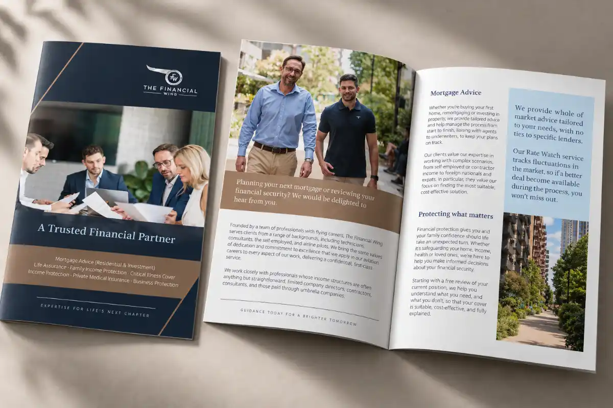
Alongside the website, we also worked on the marketing material used to support those conversations, giving The Financial Wing a more consistent presence across digital and print.
The challenge
Making specialist expertise visible
The Financial Wing already had the expertise. The challenge was making it obvious to somebody arriving on the website for the first time.
Pilots, cabin crew and other airline employees could arrive with different questions. The website needed to recognise those differences and help visitors find information relevant to their circumstances.
There was another challenge too: the amount of detail. A page could contain useful information and still be difficult to follow if it appeared in the wrong order. We needed to consider what people should see first, how the explanation should develop and where they could go next.
Project gallery


Approach
Starting with the audience
Working with Lee Gatt, we focused on routes built around who visitors were and what they needed. Dedicated landing pages gave particular audiences and campaigns a more relevant destination.
The British Airways landing page was one example. Instead of sending visitors to a broad page and asking them to find their own way, it brought audience-specific information together in one place.
Giving detailed content a clearer structure
Private medical insurance was one area where page structure mattered. We reorganised information into logical sections and reviewed how the explanation flowed, from the visitor's initial question through to the advice available and the next step.
The aim was to keep useful detail while making the broad idea easier to understand. Visitors could scan the page first, then explore the information most relevant to them.
Making the next step clear
Booking links, enquiry routes and campaign destinations formed part of the same journey. We reviewed where links led and where a call to action would be useful after a visitor had read about a service.
What was delivered
A website connected to its marketing
The work brought together audience-focused landing pages, clearer service content and routes to enquiry. We also refined the visual presentation so the website and supporting materials felt more consistent.
Brochures, flyers and digital PDFs could lead to relevant website content, carrying the same audience focus from the first piece of marketing through to the next conversation.
- Dedicated audience and campaign landing pages, including a BA-specific page.
- Clearer organisation of financial and insurance content.
- Refined booking links, enquiry routes and calls to action.
- Consistent visual presentation across the website and supporting materials.
- Connections between printed and digital marketing and relevant landing pages.
Client feedback
Thanks for your work so far on this – I really like how its turned out. The BA landing page is great.
More work
More work. Different challenges. The same attention to detail.
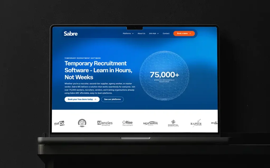
Sabre MS: from internal software to an established product family
An ongoing creative partnership connecting brand, product experience and marketing as Sabre MS grew from internal software into an established product family.
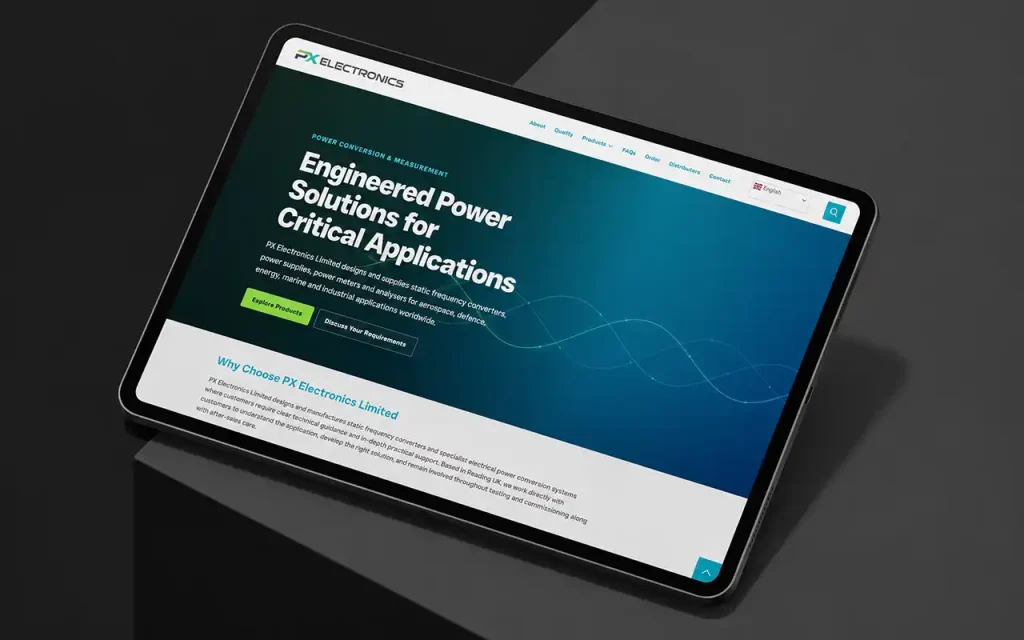
PX Electronics: making a complex catalogue easier to navigate
A clearer structure for a specialist electrical power catalogue, connecting product categories, technical information and international audiences.
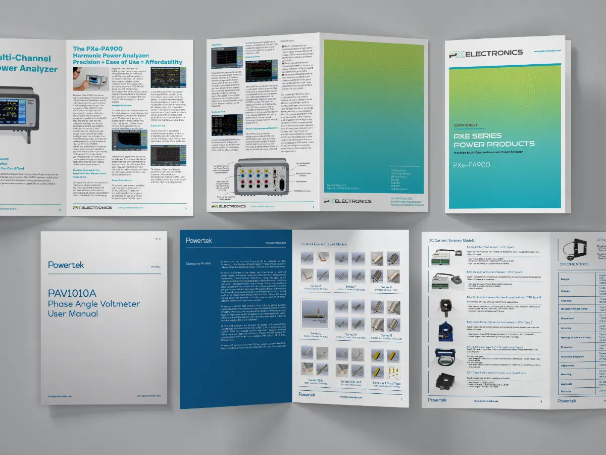
Modernising Technical Documentation for Powertek
Powertek needed one clear format for decades of technical datasheets. Kreatif designed a practical documentation system they could roll out across hundreds of products — and extend to sister brand PX Electronics.