A digital home for a specialist pilot community
Brand identity and a private online hub designed around the needs of British Airways pilots.

Overview
Flight Crew Hub was created for a very specific audience: British Airways pilots.
That distinction mattered from the beginning.
This was not a public-facing airline website trying to appeal to passengers. It was a private, specialist platform for people who shared the same profession, worked within the same airline environment and already understood the language and culture surrounding it.
Adrian Coleman came to us with the beginnings of an idea rather than a finished specification.
Our role quickly grew beyond designing a website.
We developed the Flight Crew Hub identity, created supporting brand material and worked with Adrian to shape how the digital platform itself should look and feel.
The project became a good example of what happens when the brief is allowed to develop through conversation rather than being fixed before any design work begins.
Results at a glance
- Developed the Flight Crew Hub brand identity.
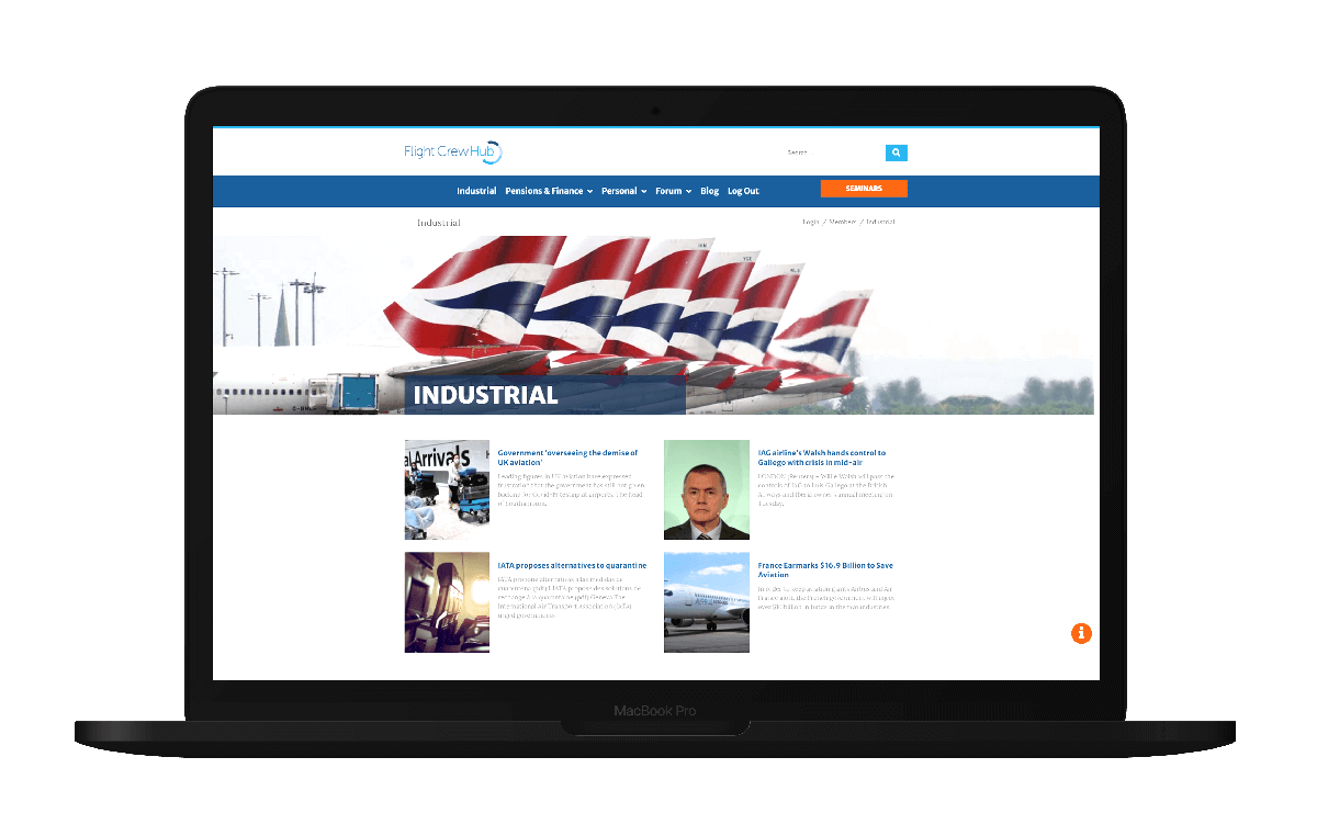
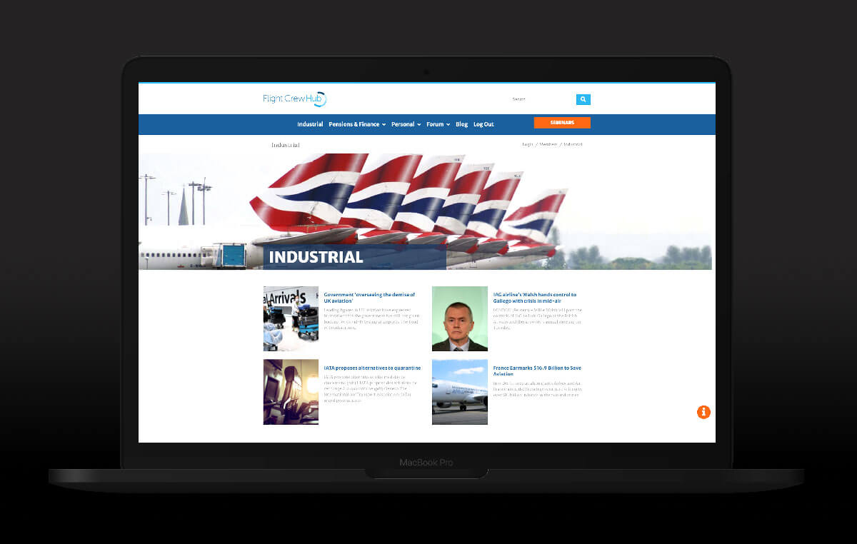
- Designed a private intranet-style platform for British Airways pilots.
- Created a responsive experience across desktop and mobile.
- Developed a visual system for content and news within the platform.
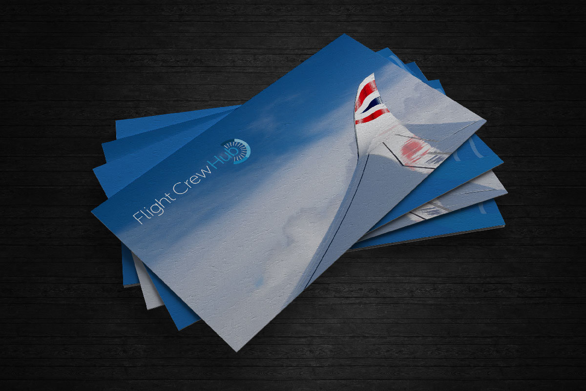
- Extended the identity into branded stationery and supporting material.
- Helped shape the project as the idea developed, rather than simply designing against a fixed specification.
The challenge
Designing for people who already know the subject
Specialist audiences present an interesting design problem.
You do not need to explain their own world back to them.
In fact, trying too hard to do so can make a platform feel like it has been designed by somebody outside the community.
Flight Crew Hub needed to feel relevant to pilots without falling into the obvious visual clichés surrounding aviation.
It also needed enough structure to accommodate useful information and content without becoming another corporate intranet.
The brand and website had to feel credible, straightforward and familiar, while still having an identity of their own.
And because the idea was still developing, the design needed enough flexibility to develop with it.
Project gallery





Approach
Shaping the brief together
Some projects arrive with a detailed specification.
Flight Crew Hub did not.
That turned out to be one of its strengths.
Adrian knew what he wanted the platform to achieve, but many of the details developed through the design process itself.
Ideas would come up in conversation. We would explore them, work through how they might fit into the wider platform and, where appropriate, let them change the direction of the project.
Rather than treating the original brief as something that could not be touched, the project was allowed to improve as we learned more about it.
What was delivered
Building the identity and platform together
The visual identity and the website were developed alongside one another.
That meant the brand was not created in isolation and then simply applied to a set of web pages afterwards.
We could see how typography, colour, imagery and graphic elements behaved in the environment where people would actually encounter them.
The identity was then extended across the wider project, including business stationery and supporting material.
On the digital side, we designed a responsive intranet-style experience that could accommodate the Hub's content while remaining straightforward to navigate.
The content itself was important.
This was a platform people were expected to return to, not a brochure website somebody might visit once.
So the design had to step back when necessary.
Content areas needed to be readable. Navigation needed to be obvious. Different types of information needed enough distinction to be recognisable without every section becoming visually noisy.
The result was less about producing one dramatic homepage and more about creating a consistent environment that could work across the whole platform.
Designing for different screens
A pilot is not necessarily sitting behind a desk when they want to access something.
That made responsive behaviour an important part of the project rather than a smaller version of the desktop site added at the end.
We considered how content, navigation and hierarchy translated across different screen sizes so the Hub could remain useful away from a conventional desktop environment.
The interface needed to feel like the same platform regardless of the device being used.
That sounds obvious now.
It was still something worth designing properly rather than assuming the browser would take care of it for us.
The result
Flight Crew Hub became a coherent brand and digital environment built around a very particular community.
The identity worked beyond the screen.
The platform could adapt across devices.
And the design gave the project enough structure to grow without making it feel like a conventional corporate intranet.
More importantly, the final result was not simply our interpretation of Adrian's original brief.
It had been shaped by the process itself.
Client feedback
“Working with Kreatif to develop Flight Crew Hub has been an organic process. The project has morphed and evolved as a result of my discussions with Nick, and he’s played a key role in helping me shape the end result. He’s an extremely talented creative, and he’s delivered far more than I expected him to. I only have to mention something to him, and he’ll respond with ideas and solutions.”
Adrian Coleman, Flight Crew Hub
More work
More work. Different challenges. The same attention to detail.
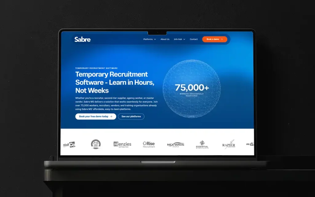
Sabre MS: from internal software to an established product family
An ongoing creative partnership connecting brand, product experience and marketing as Sabre MS grew from internal software into an established product family.
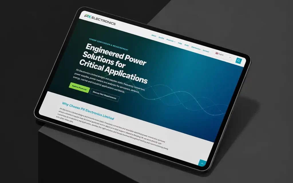
PX Electronics: making a complex catalogue easier to navigate
A clearer structure for a specialist electrical power catalogue, connecting product categories, technical information and international audiences.
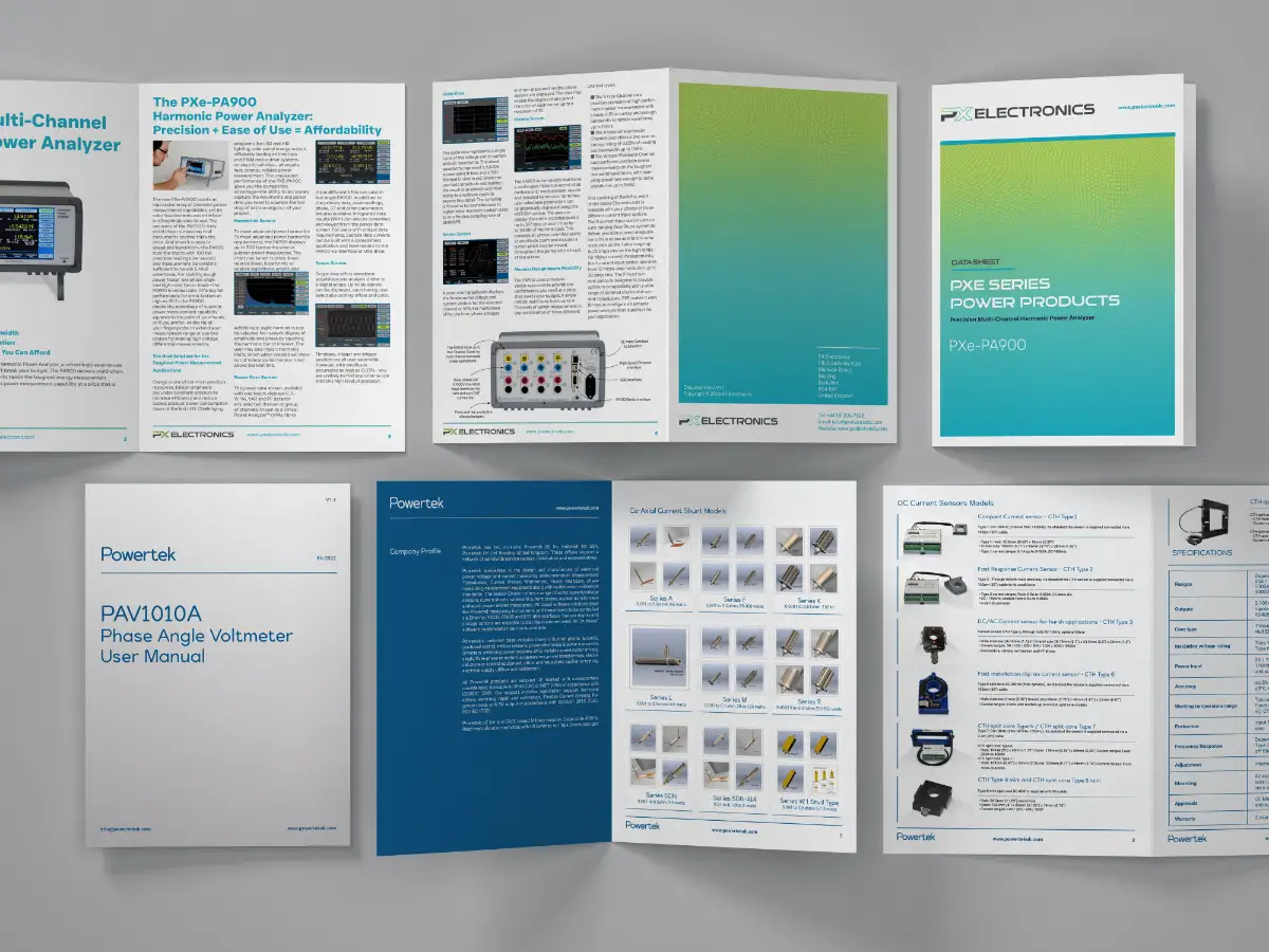
Modernising Technical Documentation for Powertek
Powertek needed one clear format for decades of technical datasheets. Kreatif designed a practical documentation system they could roll out across hundreds of products — and extend to sister brand PX Electronics.